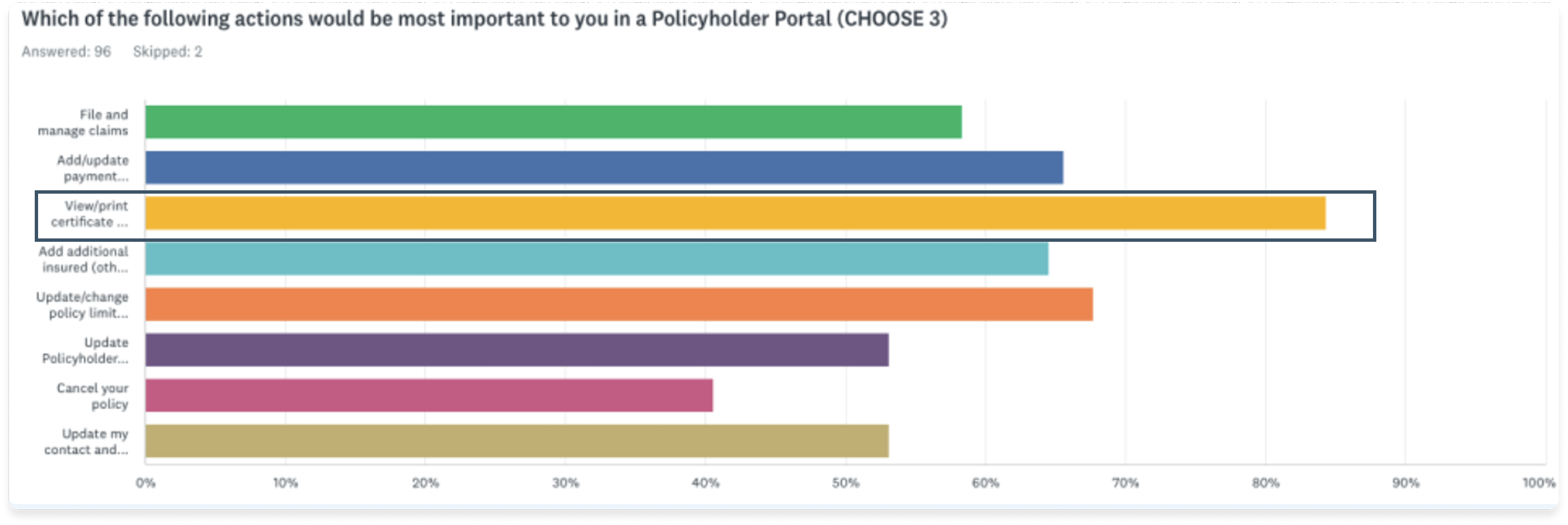
As our hackathon project launched, I tracked a few metrics at the end of the first day to learn about user engagement and success of our project.
21%
adoption rate at launch
15.4%
users who entered the COI flow generated a COI copy
11.9%
users who generated a copy used the download COI option
5.6%
users who generated a copy used the send email option
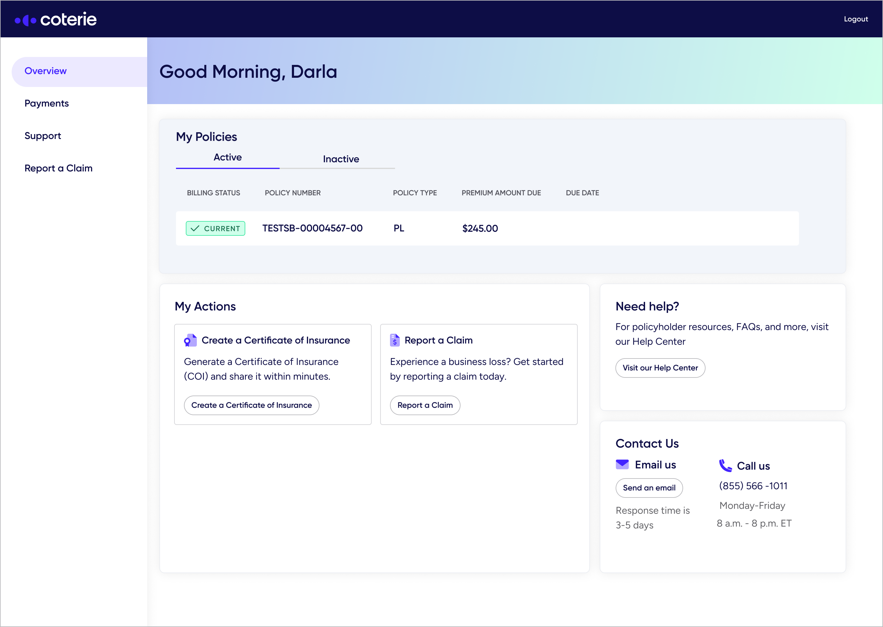
Strong Initial Awareness
21% of users clicked the entry point. With no in-app guidance via Pendo nor prior feature promotion, all discovery was organic, confirming that the new placement and layout made the COI Generator easy to find.
Good Conversion Into the Generator
73% of users who clicked the entry point continued to engages with the COI flow, indicating strong relevance and clear alignment with policyholder needs.
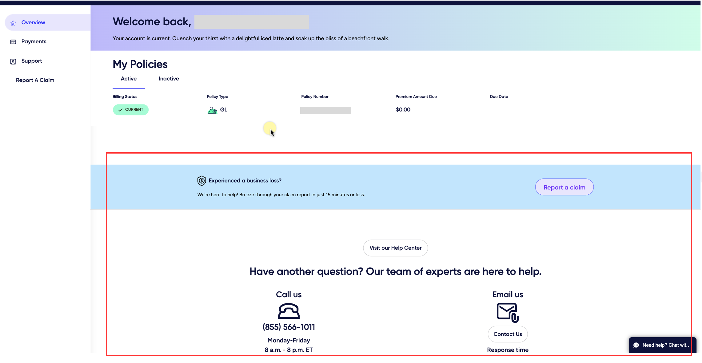
Successful COI Generation
73% of users who clicked the entry point continued to engages with the COI flow, indicating strong relevance and clear alignment with policyholder needs.
30.5%
adoption rate at launch
23.5%
users who entered the COI flow generated a COI copy
20.1%
users who generated a copy used the download COI option
8.2%
users who generated a copy used the send email option
Within 30 days of launch, engagement continued to trend upward. I checked with Salesforce to see if COI-related support requests had decreased. While they couldn’t isolate COI-specific tickets, they confirmed there was no increase in request, even with higher overall usage from a new partnership. This suggested that the feature did not add support burden.
These 2 heatmaps show user behavior before and after the redesign and COI Generator feature addition. We can see that the COI Generator button is frequently interacted and have become a core functionality within Billing Center.
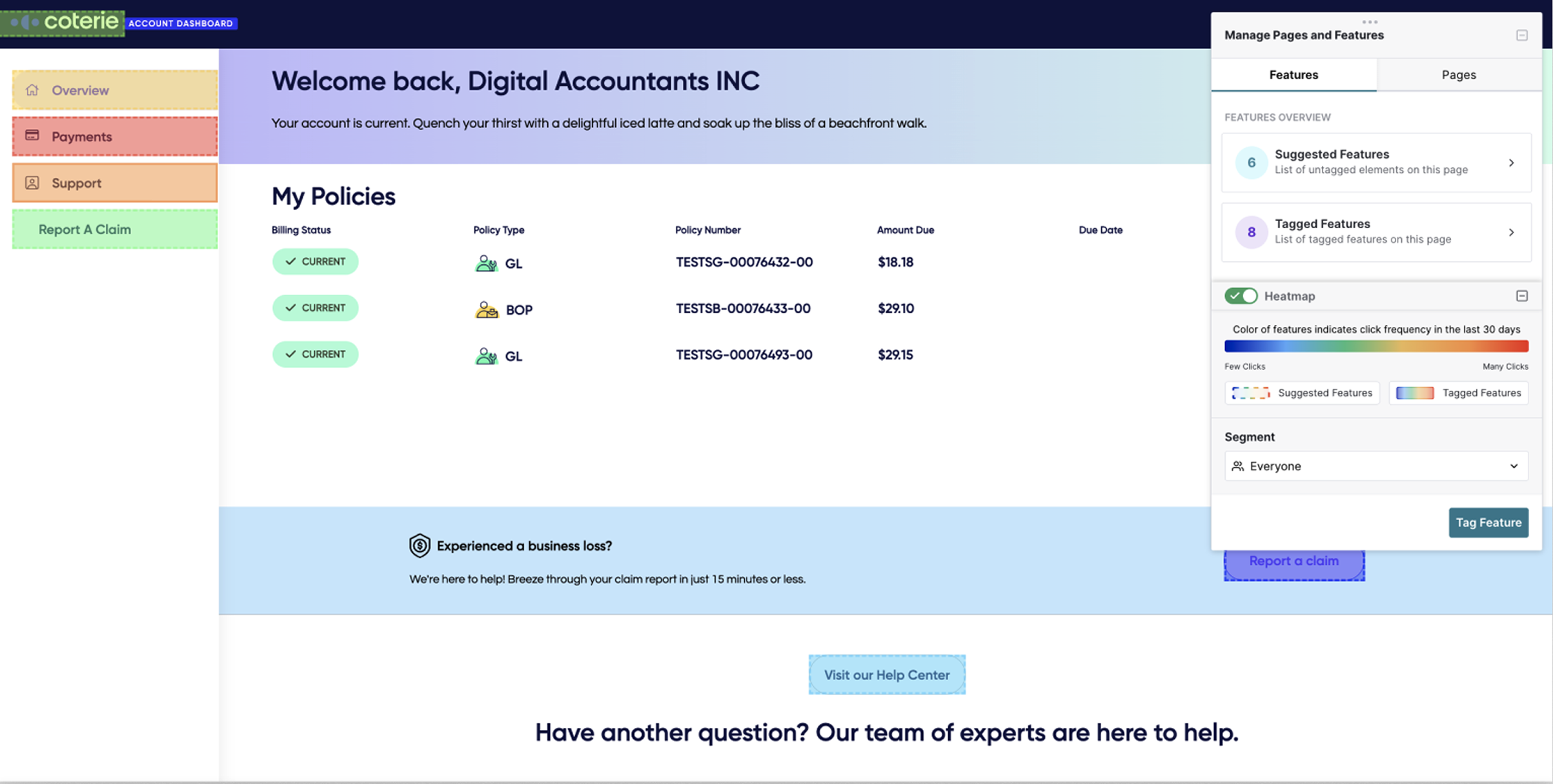
Before
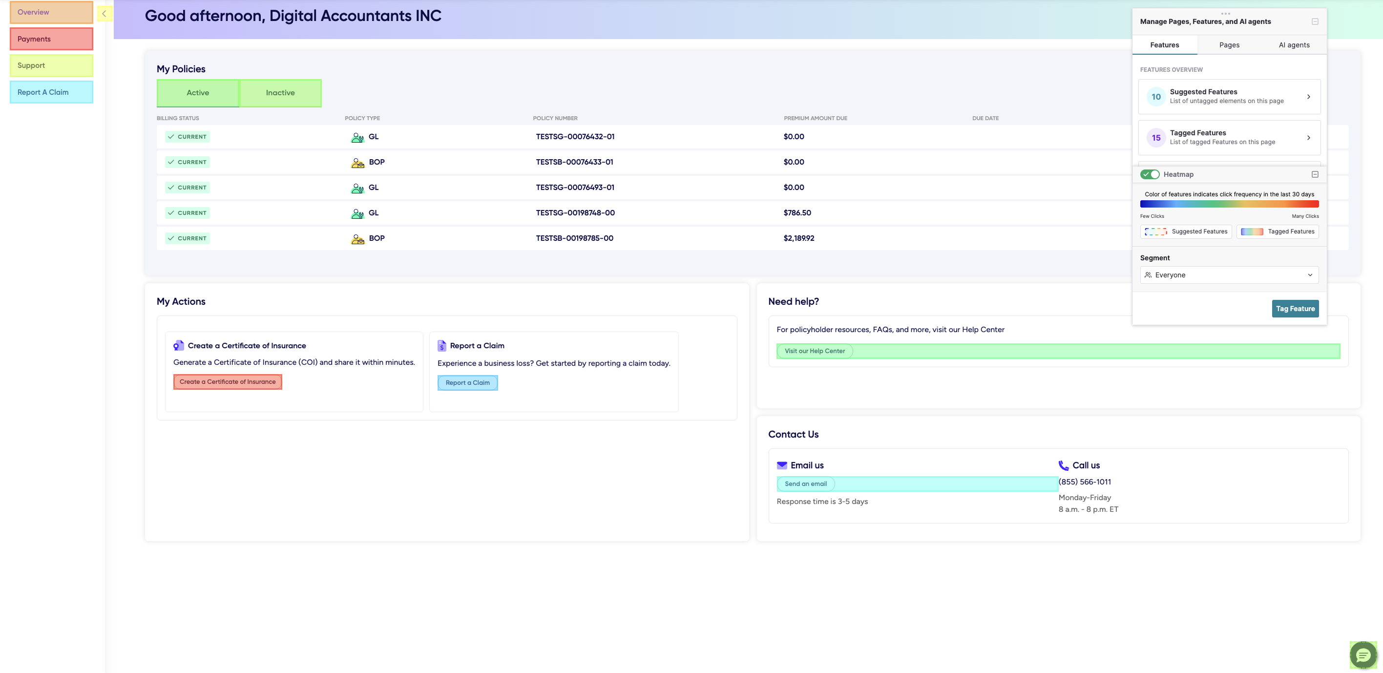
After
Data-driven decisions go a long way
Using our previous research and analytics tools, I was able to validate our project hypothesis quickly. These data points became our anchor point when we built our project. It gave us the confidence that we were building something that would greatly benefit our customer support at Coterie and bring value to our policyholders.
Valuing collaboration and different inputs
Seeing how we leaned on each other’s strengths throughout the project reminded me how essential mutual respect, trust, and strong collaboration are key when it comes to teamwork. Our collaboration made the whole process fun and was evident to the other teams.
Thinking in components and systems
One aspect that made our workflow efficient was to reuse components from our previous COI work. By reusing components that were available to us, we were able to build the design quickly. During this hackathon, I learned that as a designer, we have the responsibility to utilize existing components and have the forethought of the effects of creating new components, especially when not needed. Using what's available to us, it became easier for everyone involved building the project and acted as a shared language between designers and engineers.